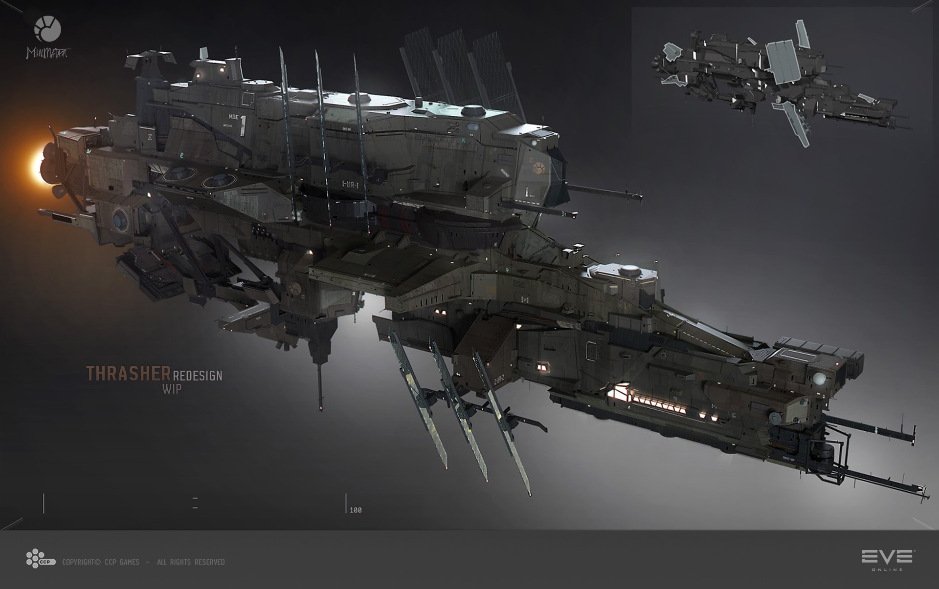
Mmmmmmm. I don't know about this. CCP are redesigning the Thrasher.
I saw the concepts and cried when I got to E.
Thank Bob that they didn't go ahead with the mini-Bowhead. Whilst its better than E, I'm not sure about the current direction they are taking it. Looks more Caldari and WHERE THE HELL IS THE RUST GUYS?
Time will tell if I need to slip Rixx a couple of billion to run the Save the Thrasher campaign!
I saw the concepts and cried when I got to E.


I stand ready if bad decisions are made!
ReplyDeleteWe just need to stop the bleedin' Caldarification of EVE ships.
ReplyDeleteToo many flat planes/angular designs w/ thin rods sticking out at odd angles.
This thrasher may be the best of the lot, but it does nothing to evoke the original, nor even the original design motifs.
Minmatar ships are muscular without the thin fat layer and skin covering the bones, sinews, blood vessels, and muscles.
Concept art is often gray. Don't fret on that part.
ReplyDeleteBut boo the thrasher concepts.
I'm trying to figure out what's wrong with the current thrasher design. I think it's a great looking ship.. Almost all the new looks are bulky, and I'm not sure any of the smaller minmatar ships should invoke a bulky feeling.
ReplyDelete